IKL-ESGS-Cover_300x400_v2

ESG & Sustainability ConneXion Centre

The Voice for “Responsible Business”

Connecting stakeholders, sharing knowledge, and inspiring positive change.

The identity created for this platform needed to be simple, contemporary and somewhat literal in regard to ESG and sustainability. Hence the usage of the green and blue traditional colours associated with sustainability. This approach was taken through both the brochure and case studies, showcasing a comprehensive compilation of case studies from leading global companies under the InvestKL portfolio, highlighting the positive impact achieved through sustainable business practices.

Through InvestKL a newly created platform called ESG & Sustainability ConneXion Centre (ESGS CXC), will serve as a hub to drive sustainable business in Greater Kuala Lumpur. The platform is to foster collaboration, scale impact, raise awareness, and facilitate education about Sustainability and its related initiatives. Connecting stakeholders, sharing knowledge, and inspiring positive change. Integrating responsible business across the value chain and advancing Malaysia’s aspirations towards an inclusive and sustainable economy.

ASAE_000e

Selfless Service

Selfless Service

Celebrating those who give to better our lives.

The criteria of the awards are based on 2 principles; The value of Seva (selfless service) should be evident, as framed in Sikhi and the activities of the individuals should positively contribute to the social and economic development of Australia.

Being a newly created awards every element, and visual experience of the Awards needed to be developed and created; from the visual language, identity, collaterals, website and other touchpoints. With the long term significance of the awards in mind, the awards needs to be seen as contemporary and relevant. Through symbols, specific colours, simplistic lines and graphics, the overall look and feel of the awards is based on capturing and representing the idea of community, the Sikh identity and the principle of giving selflessly.

An initiative of Sikh Youth Australia (SYA) and Young Sikh Professionals Network (YSPN), the awards are about recognising the efforts and contribution to society by individuals from the Australian Sikh community. These awards are also about creating a positive and informative view in the broader community of the Sikh faith and its values, identity and culture.
AOC_000e1

The Alliance of Chiropractic

The Alliance of Chiropractic

Client

The Alliance of Chiropractic

Scope

Creative direction, branding & website design.

More Info

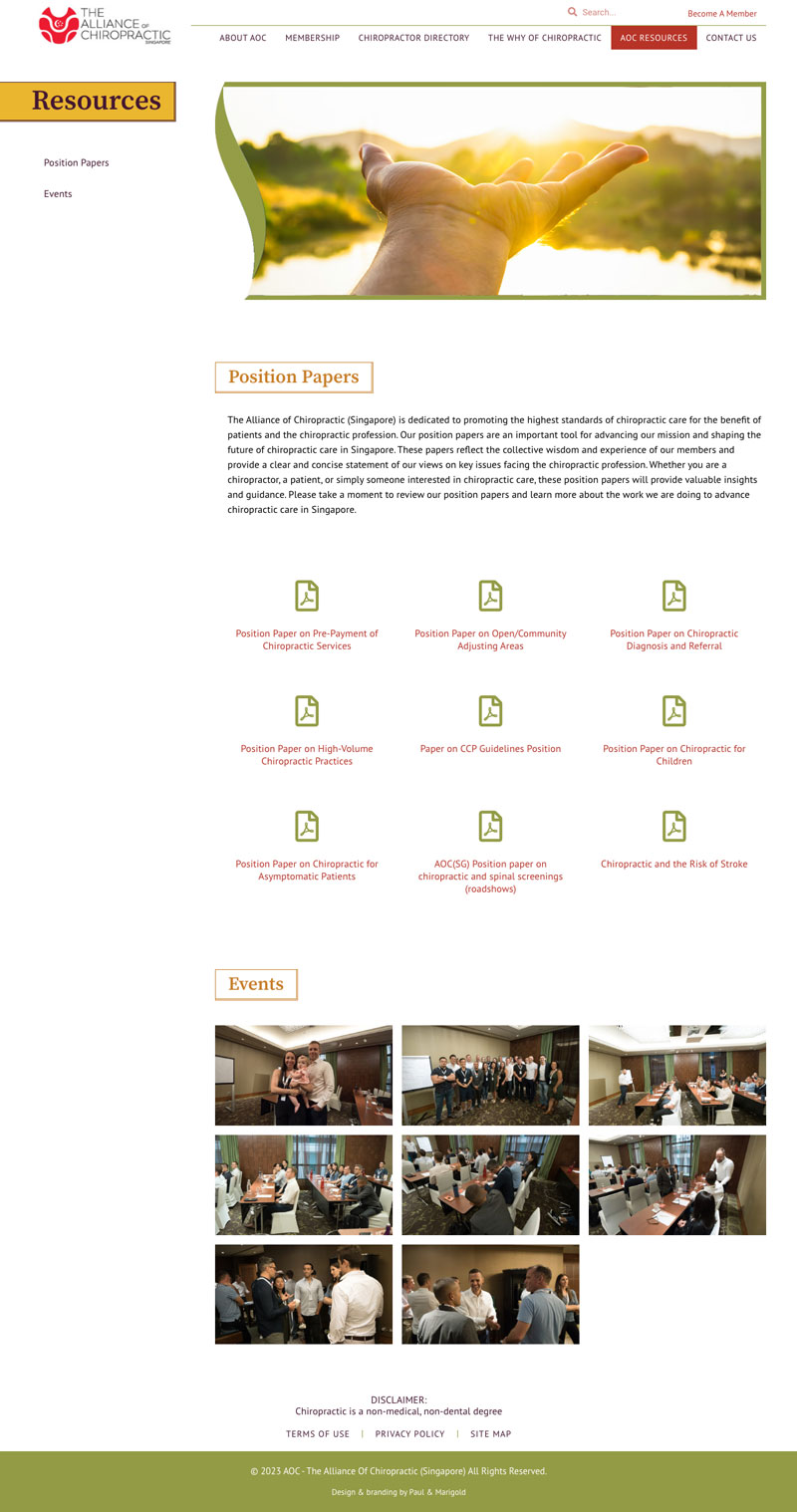
Founded in 2008 the AOC was evolving further as the leading voice and association for Chiropractors in Singapore, thus a refresh of their website, the face of the association was needed.

The vision of the AOC is not to only be for the Chiropractors, but equally for the general public. The website needs to be a platform of resource and information where users can locate a Chiropractor, understanding more about Chiropractors, be aware of the AOC community outreach/volunteering events and programmes.

The look and feel of the website needed to have a balance, catering to both types of users; professional and engaging to those in the Chiropractic field, other associations and government bodies and inviting and soft, non medical looking for the general public.

pinnacle_001e

Pinnacle Chiropractic

Pinnacle Chiropractic

Client

Pinnacle Chiropractic

More Info

After 10 years of being in practice it was time for a refresh that reflects who and what the Pinnacle brand and practice is today. As such there was a need to revamp the website and capture the Pinnacle brand positioning and brand promise.

Pinnacle is more than just a Chiropratic practice , but a lifestyle brand, an alternative healing and wellness space for the community and families.

Targeting families and the community the website and the brand needed to be seen as inviting, warm, engaging and personal.

BRT_000e

Genuinely Caring

Genuinely caring

Enabling efficient and reliable “Point of Care”

With the goal to simplify the IT infrastructure, digital needs and services for healthcare providers in SE Asia, BRT has quickly established itself as leader if not the only IT provider to the healthcare sector in Singapore. Keeping up with the growth of the business there was a need for brand refresh, providing BRT with a blueprint moving forward.

Having established and developed the brand’s story, positioning, promise, mission and vision statements we now have a much stronger visual language and brand presence through the identity and various brand touch points. The use of a blue coloured gradient represents the reliable, professional and authentic positioning of BRT. A brand that evolves alongside the ever changing and growing digitalisation of the healthcare sector. The use of a butterfly as part of the identity symbolises change, love and life.

BRT Tagline – The tagline line has come from the BRT goal of simplifying and taking care of the whole IT process for their clients in healthcare.

Enabling efficient and reliable “Point of Care”

Having established and developed the brand’s story, positioning, promise, mission and vision statements we now have a much stronger visual language and brand presence through the identity and various brand touch points. The use of a blue coloured gradient represents the reliable, professional and authentic positioning of BRT. A brand that evolves alongside the ever changing and growing digitalisation of the healthcare sector. The use of a butterfly as part of the identity symbolises change, love and life.

BRT Tagline – The tagline line has come from the BRT goal of simplifying and taking care of the whole IT process for their clients in healthcare.

ezee_000e

Ready to Eat

Ready to eat

Creation and development of a new ready to each product

The final pack designs have been designed to standout on the retail shelves through the use of clear differentiating elements. The Ezeefood identity has been placed in a holding device for clear branding, each product is differentiated via a colour palatte that is eye catching against the dark background, product shots and clear large sized typography. For clear communication of information we have made use of customised icons. Finally bringing everything together and localising the products is the identifying batik patterns.

Syed Group operates 14 restaurants in Malaysia, produces inflight meals for Air Asia and Malindo airlines, is a premier caterer and under their EzeeFood brand produces frozen meals. To expand their offering further we were brought in to help with the launch of the EzeeFood line of ready to cook and ready to eat retail products.

Creation and development of a new ready to each product

Syed Group operates 14 restaurants in Malaysia, produces inflight meals for Air Asia and Malindo airlines, is a premier caterer and under their EzeeFood brand produces frozen meals. To expand their offering further we were brought in to help with the launch of the EzeeFood line of ready to cook and ready to eat retail products.

Azmilaw_001e

Client Centric by Nature

Client centric by nature

Client

Azmi & Associates

Scope

Creative direction, branding & website design.

More Info
With 20 years under its belt the Azmi & Asscociates law firm realised it was time to prepare for the next 20 years. With a website more than 10 years old running on obsolete technology it was only natural to revamp the website to something that is contemporary in terms of its design, functionality and overall brand interaction. Taking the firm forward in positioning itself as a relevant, client centric, well established and proven firm, attractive to potential clients and employees locally and internationally was a must.
 
After defining the Brand Personality, Promise and the overall Business, Brand and User goals, we looked outside the legal industry for inspiration. Resulting in the idea of the “consultant” which by definition embodies the brand experience that Azmi & Assocaitions aspires for. User friendly and easy to navigate visually the site is vibrant with inviting images and bold fonts with a colour palette that captures confidence, reliability, innovation, contemporary and accessibility.
Tokenotic-Logo

For Todays Digitalised World

For todays digitalised world

Creation of a new brand in token security revolutionising the traditional finance world
The icon and font that makes-up the new identity is simple and strong, representing  today’s digitalised world, marketplaces and assets that Tokenotic’s deals with and operates in. Compatible with both digital and print formats, the concept has been continued through to the graphics, infographics and icons. The colours follow the Blockchain Worx corporate colours of blue representing trust, professionalism and confidence.
Under Blockchain Worx Tokenotic.com offers a “comprehensive Securities Tokenization Platform and Digital Asset Marketplace” As a new product and brand the creation of an identity, visual language, infographics, website, marketing collaterals and a couple of articles were needed.
Creation of a new brand in token security revolutionising the traditional finance world
Under Blockchain Worx Tokenotic.com offers a “comprehensive Securities Tokenization Platform and Digital Asset Marketplace” As a new product and brand the creation of an identity, visual language, infographics, website, marketing collaterals and a couple of articles were needed.
ICDM_000e

Pillars of Strength

Pillars of Strength

A new entity and authority inspiring wisdom, higher ideals and stability

Our inspiration has come from geometric shapes giving us form and structure in the identity that is strong and confident with overlapping letters that represent the diversity, depth and transparency of ICDM’s knowledge, services and which one finds in corporate boardrooms. The fresh blue and purple colour palette are symbolic of what boardrooms and its members represent such as trust, authority, dignity and creativity.

As a new entity ICDM, the Institute of Corporate Directors Malaysia was looking for an identity, corporate website, collaterals and visual language that is fresh, innovative, contemporary, authoritative, and embodies their dedication “to enhancing the professionalism and effectiveness of corporate directors in Malaysia….. and promoting good governance amongst boards of companies.”

A new entity and authority inspiring wisdom, higher ideals and stability

As a new entity ICDM, the Institute of Corporate Directors Malaysia was looking for an identity, corporate website, collaterals and visual language that is fresh, innovative, contemporary, authoritative, and embodies their dedication “to enhancing the professionalism and effectiveness of corporate directors in Malaysia….. and promoting good governance amongst boards of companies.”
PIAM_000e

The Squared Circle

The squared circle

Bringing life back to a 40 year brand through a corporate brand refresh

We have highlighted the capital ‘P’ as a symbolic icon of the association through a fresh and bold visual. It sends a strong message of not only being ‘people oriented’ but also inclusive of the versatile ‘personalities’ embodied by the association. The curvatures of the icon with its fluid circular motion represents the constant progression throughout the many facets of the association. The heritage, constant progression and depth of the association is also captured in the colours, where we have kept the original dark green and have taken it further with the gradient of greens and yellow that represent growth, vitality, reliability and originality.
Any brand with a heritage behind it at some point needs to be updated and brought into the present. As a 40 years old brand PIAM needed a refresh and meaning brought back to the brands identity, positioning and story. Striking the right balance between heritage and the evolutionary process of progressing into the future was critical in representing the brand and the association. This balance can be seen through the identity, collaterals and online reporting.

Bringing life back to a 40 year brand through a corporate brand refresh

Any brand with a heritage behind it at some point needs to be updated and brought into the present. As a 40 years old brand PIAM needed a refresh and meaning brought back to the brands identity, positioning and story. Striking the right balance between heritage and the evolutionary process of progressing into the future was critical in representing the brand and the association. This balance can be seen through the identity, collaterals and online reporting.