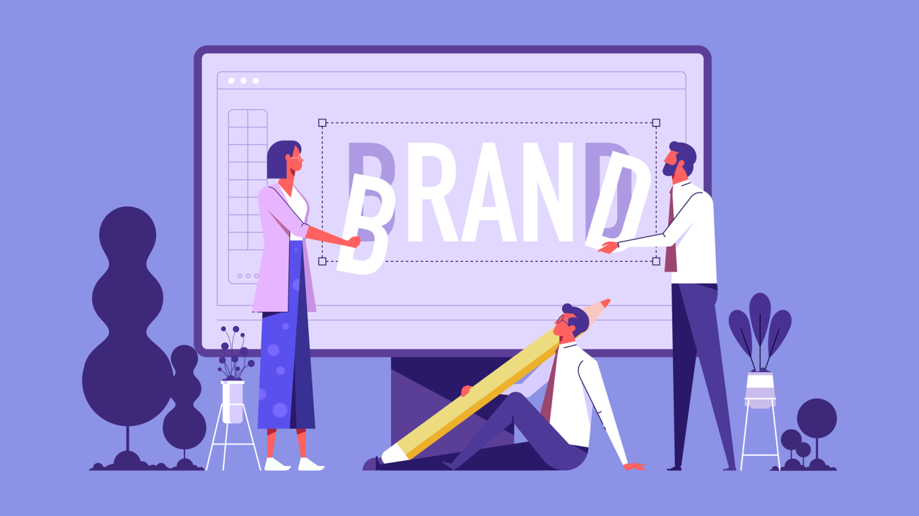
Branding Gold Insights
Visual branding such as logos, marketing collaterals, websites and advertisements make up a large proportion of the branding and communications of most companies.
Graphic designers are a crucial part of getting these visuals right for the brand and so it follows that unless you can communicate your brand strategy effectively to designers, you will put a large part of your branding collateral at risk – and that’s a huge risk!
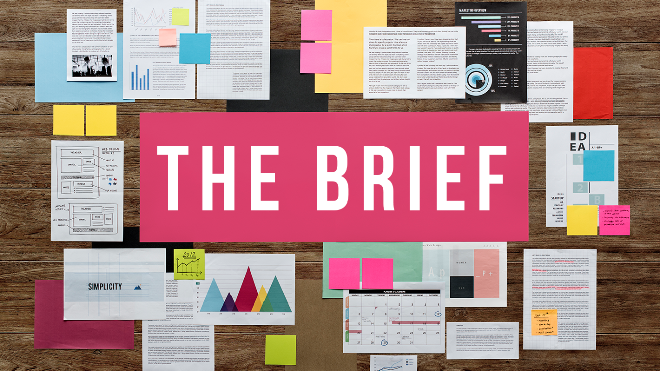
The main method of communicating branding objectives to designers is the “Brief”. Get this wrong and it will result in lost time, frustration, cost, missed deadlines and substandard output. Here are the four worst types of brief and you must avoid them with a passion.
The Read My Mind Brief
“I think you understand what we need!” These words are the kiss of death for a designer. Even if you have worked with a design team for years, they still cannot read your mind.
Of course, the words actually used in a brief are not as blatant as suggested here and would usually be couched in terms such as, “design in accordance with our standards,” or “designs appropriate to our branding strategy” or “as explained in previous briefs”. The kicker is that the standards and branding strategy are seldom shared.
The good brief articulates what you want the design to achieve and for whom; otherwise, you are almost certain to get something unusable. It is like expecting an architect to design a house for you, without sharing vital information such as the number of rooms, bathrooms or the age of the resident.
Every brief must articulate, what you need, the objectives, the target market or consumer group for whom the design is being developed and any mandatory elements such as the use of certain words or timing.
The Micro-Defined Brief
On the other end of the scale, is the brief that gives a list of requirements from colours to fonts, to the number of curves allowed and the number of straight lines all detailed to the nth degree. Marketing teams that provide this kind of brief often mistakenly believe that the purpose of the brief is to tell the designer what to do.
This is not true – the design is the designers job and the designer’s expertise. In the brief you need only say what you want achieved, not how. For instance, it is valid to ask in the brief, “The design should evoke a light happy feeling for our target consumers, who are mainly in their 40s, married and have one child and a mortgage and are of xxx descent, living in yyyy” Now it is up to the designer to create designs that achieve the objective of a, “light happy feeling”, using the other information provided to good effect.
The ‘Give Me Some Options’ Brief
Translated this means, “I won’t know what I want until I see it. I am just fishing for inspiration, so please spend tons of time on ideas, of which I will reject 95% or indeed all of them.” This is both inefficient and incredibly demoralising. Much better to spend some time to write a good brief that forces you to think about and define what you want. The required design will appear quicker and more economically whilst retaining the sanity of the designer and the relationship between marketing and design.
The Personal Preferences Brief.
This type of brief is not hard to abide by, but doing so will probably do a disservice to the client. It is not uncommon to get a brief which stipulates, “minimal white space” or “preferred pastel colours”. When these requirements are based on evidence from the target market, then they are very useful. However, if based on personal preference then they could hinder the effectiveness of the design, because the target market’s preferences could be quite different from your own.The takeaway from these nightmare briefs, is that for an effective design brief it is best to explain the objectives of the design to the designer not how to do it. Then provide a briefing about the characteristics of the people who will consume the design. Next, leave the designer to get on with the job and finally and most importantly, judge the end product through the eyes of your target market and not the lens of your personal preferences.