img_endeavor01

At the Forefront of New Ideas

At the Forefront of New Ideas

Endeavor_p03
Client

Endeavor Malaysia

Scope

Corporate Reporting

More Info

Part of a global network Endeavor Malaysia helps innovative entrepreneurs grow through mentorship from top business leaders and developing the scale-up ecosystem by connecting the best entrepreneurs to the wider entrepreneurship network.

Having been in Malaysia for 5 years it was time for Endeavor Malaysia to increase their presence amongst entrepreneurs and the wider business community by establishing themselves as thought-leaders in the scale-up space.

Working from the global brands corporate guidelines, we created a visual and design language comprising of bold colours and clean aesthetics that is appealing to the local market through from the collaterals, infographics, to the their social media communications and printed material such as the 2018 Impact Report.

mamsb_001e

Corporate, Professional and International

Corporate, Professional and International

Client

Malaysia Association of Money Services Business (MAMSB)

More Info

Six years after the creation and launch of MAMSB, there was a need to ensure that the association remained relevant and current now and in the future.

As the website is the main touch point of interaction and face of the association, it needed to be a 1 stop centre of information. For members and non-members of the industry and association.

The look and feel of the website needed to take on more of a professional, international, corporate and fresh look that members, professionals and financial institutions can relate to and have confidence in.

IKL-ESGS-Cover_300x400_v2

ESG & Sustainability ConneXion Centre

The Voice for “Responsible Business”

Connecting stakeholders, sharing knowledge, and inspiring positive change.

The identity created for this platform needed to be simple, contemporary and somewhat literal in regard to ESG and sustainability. Hence the usage of the green and blue traditional colours associated with sustainability. This approach was taken through both the brochure and case studies, showcasing a comprehensive compilation of case studies from leading global companies under the InvestKL portfolio, highlighting the positive impact achieved through sustainable business practices.

Through InvestKL a newly created platform called ESG & Sustainability ConneXion Centre (ESGS CXC), will serve as a hub to drive sustainable business in Greater Kuala Lumpur. The platform is to foster collaboration, scale impact, raise awareness, and facilitate education about Sustainability and its related initiatives. Connecting stakeholders, sharing knowledge, and inspiring positive change. Integrating responsible business across the value chain and advancing Malaysia’s aspirations towards an inclusive and sustainable economy.

Azmilaw_001e

Client Centric by Nature

Client centric by nature

Client

Azmi & Associates

Scope

Creative direction, branding & website design.

More Info
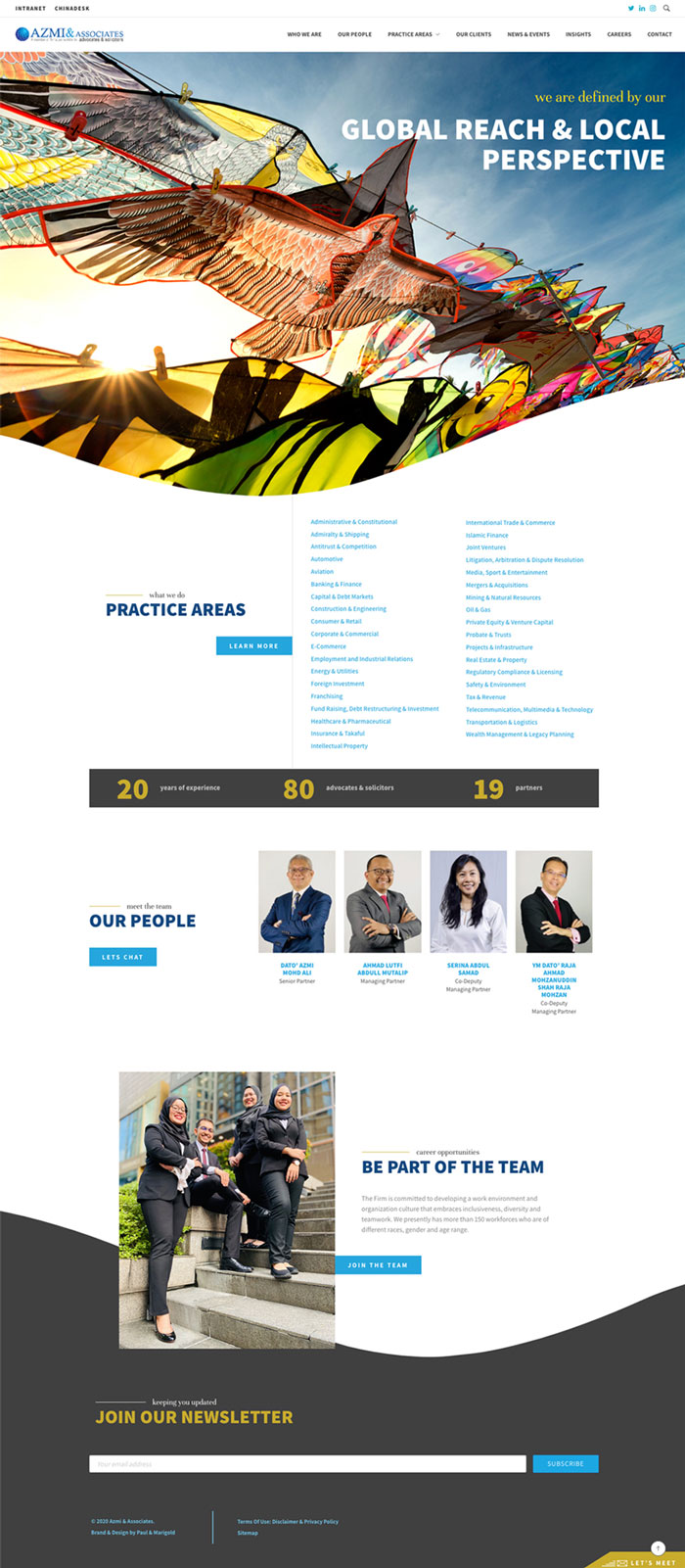
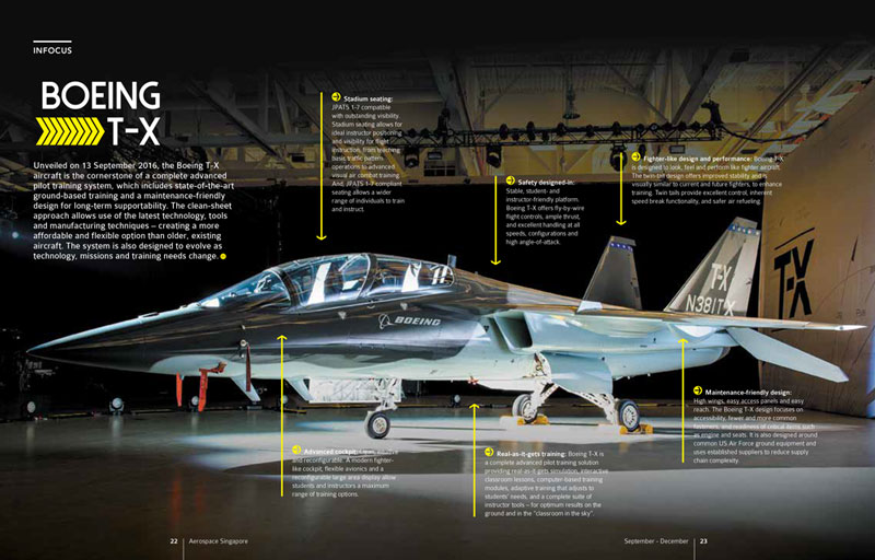
With 20 years under its belt the Azmi & Asscociates law firm realised it was time to prepare for the next 20 years. With a website more than 10 years old running on obsolete technology it was only natural to revamp the website to something that is contemporary in terms of its design, functionality and overall brand interaction. Taking the firm forward in positioning itself as a relevant, client centric, well established and proven firm, attractive to potential clients and employees locally and internationally was a must.
 
After defining the Brand Personality, Promise and the overall Business, Brand and User goals, we looked outside the legal industry for inspiration. Resulting in the idea of the “consultant” which by definition embodies the brand experience that Azmi & Assocaitions aspires for. User friendly and easy to navigate visually the site is vibrant with inviting images and bold fonts with a colour palette that captures confidence, reliability, innovation, contemporary and accessibility.
ICDM_000e

Pillars of Strength

Pillars of Strength

A new entity and authority inspiring wisdom, higher ideals and stability

Our inspiration has come from geometric shapes giving us form and structure in the identity that is strong and confident with overlapping letters that represent the diversity, depth and transparency of ICDM’s knowledge, services and which one finds in corporate boardrooms. The fresh blue and purple colour palette are symbolic of what boardrooms and its members represent such as trust, authority, dignity and creativity.

As a new entity ICDM, the Institute of Corporate Directors Malaysia was looking for an identity, corporate website, collaterals and visual language that is fresh, innovative, contemporary, authoritative, and embodies their dedication “to enhancing the professionalism and effectiveness of corporate directors in Malaysia….. and promoting good governance amongst boards of companies.”

A new entity and authority inspiring wisdom, higher ideals and stability

As a new entity ICDM, the Institute of Corporate Directors Malaysia was looking for an identity, corporate website, collaterals and visual language that is fresh, innovative, contemporary, authoritative, and embodies their dedication “to enhancing the professionalism and effectiveness of corporate directors in Malaysia….. and promoting good governance amongst boards of companies.”
PIAM_000e

The Squared Circle

The squared circle

Bringing life back to a 40 year brand through a corporate brand refresh

We have highlighted the capital ‘P’ as a symbolic icon of the association through a fresh and bold visual. It sends a strong message of not only being ‘people oriented’ but also inclusive of the versatile ‘personalities’ embodied by the association. The curvatures of the icon with its fluid circular motion represents the constant progression throughout the many facets of the association. The heritage, constant progression and depth of the association is also captured in the colours, where we have kept the original dark green and have taken it further with the gradient of greens and yellow that represent growth, vitality, reliability and originality.
Any brand with a heritage behind it at some point needs to be updated and brought into the present. As a 40 years old brand PIAM needed a refresh and meaning brought back to the brands identity, positioning and story. Striking the right balance between heritage and the evolutionary process of progressing into the future was critical in representing the brand and the association. This balance can be seen through the identity, collaterals and online reporting.

Bringing life back to a 40 year brand through a corporate brand refresh

Any brand with a heritage behind it at some point needs to be updated and brought into the present. As a 40 years old brand PIAM needed a refresh and meaning brought back to the brands identity, positioning and story. Striking the right balance between heritage and the evolutionary process of progressing into the future was critical in representing the brand and the association. This balance can be seen through the identity, collaterals and online reporting.

AEROSPACE_000e

It’s a Lifestyle

It's a lifestyle

A refreshed Aerospace magazine with a balance of industry and lifestyle

We played around a concept that is fresh, sophisticated that speaks lifestyle and aerospace. The clean space and vividly large imagery complement one another while the fonts, colour palettes and layout reintroduced the content to feel both contemporary and modern topped off with cover designs that is distinctive to Aerospace Singapore.

Aerospace Singapore magazine is for those in the Aerospace industry, as a fast paced and futuristic industry it deserves a magazine that can relate. So tasked with breathing life into the magazine again we took it from your typical wordy industry magazine and cranked the design and look up several notches to match that of a trendy lifestyle publication.

A refreshed Aerospace magazine with a balance of industry and lifestyle

Aerospace Singapore magazine is for those in the Aerospace industry, as a fast paced and futuristic industry it deserves a magazine that can relate. So tasked with breathing life into the magazine again we took it from your typical wordy industry magazine and cranked the design and look up several notches to match that of a trendy lifestyle publication.

Related Projects