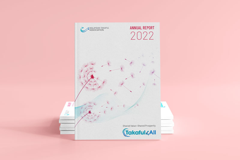
Playing an active leadership role and acting as the voice of the Takaful Insurance industry the Malaysian Takaful Association Annual Reports are aimed at sharing the positive impact and results on the industry for all stakeholders including the community.
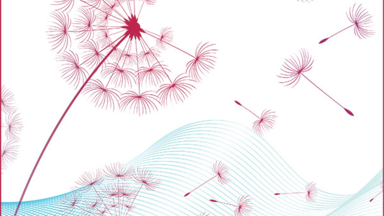
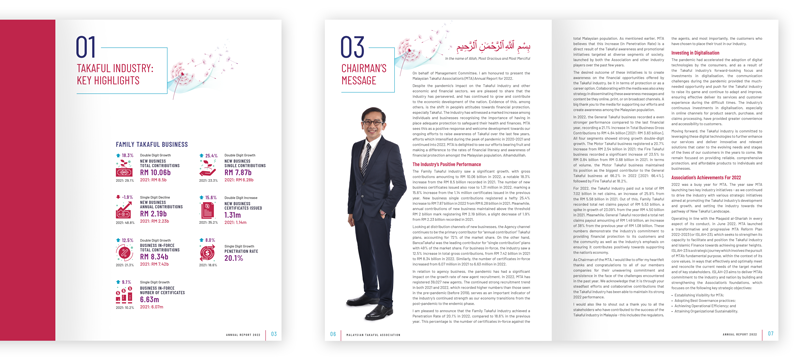
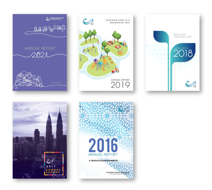
The themes of the Annual Reports are taken through from the cover to the financials with graphics and colour palettes, representing the positive results and impact that insurance has on us as individuals, families and communities. As the reports are very text heavy we have kept the layouts simple, clean with as much breathing space possible and clean fonts, making it easier for readers to navigate through.
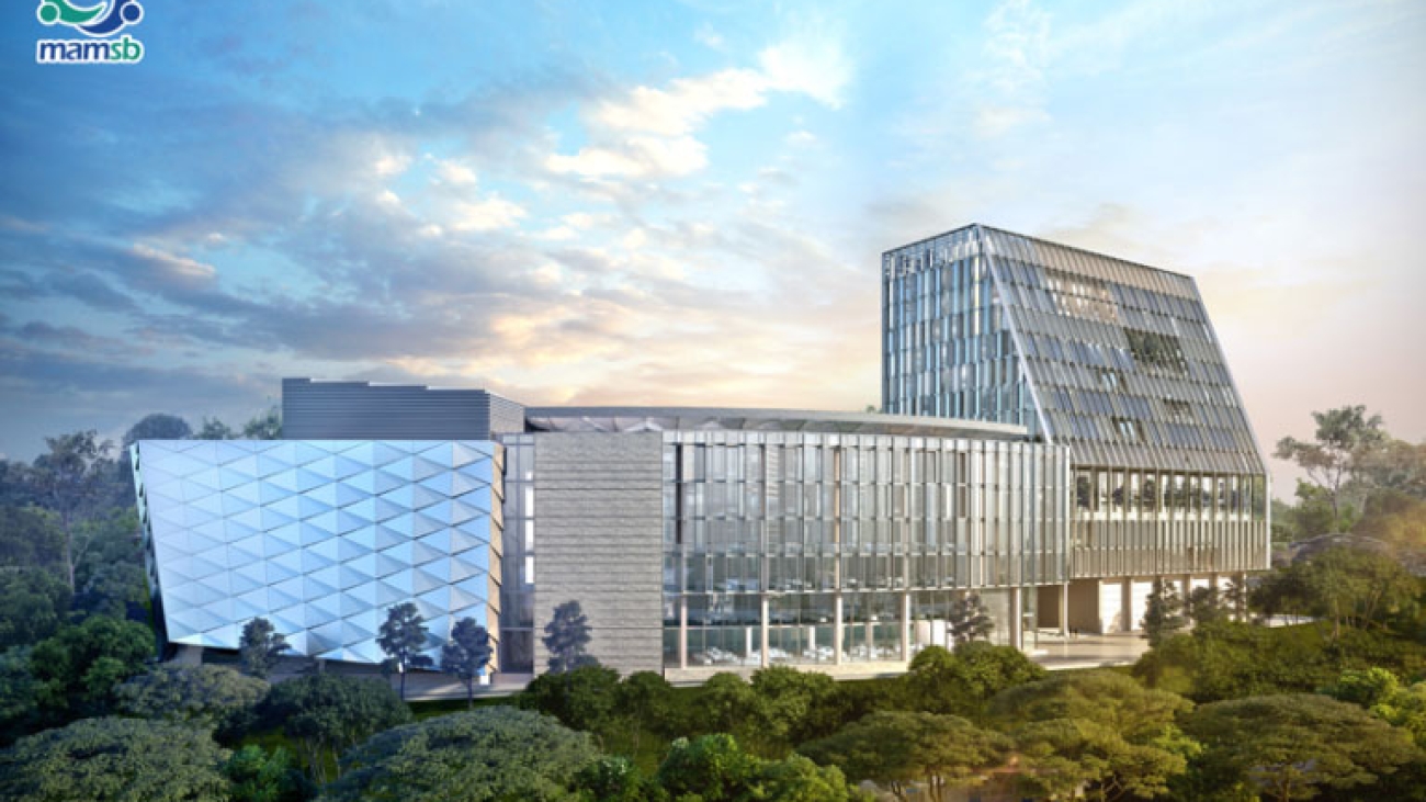
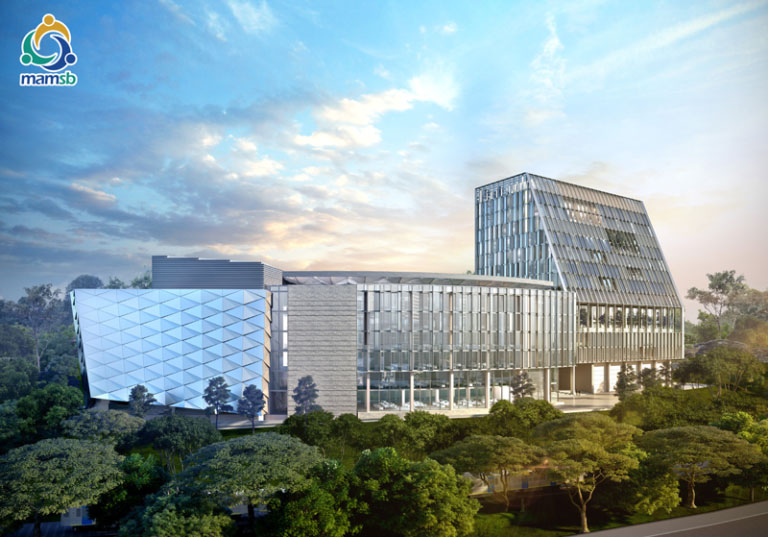
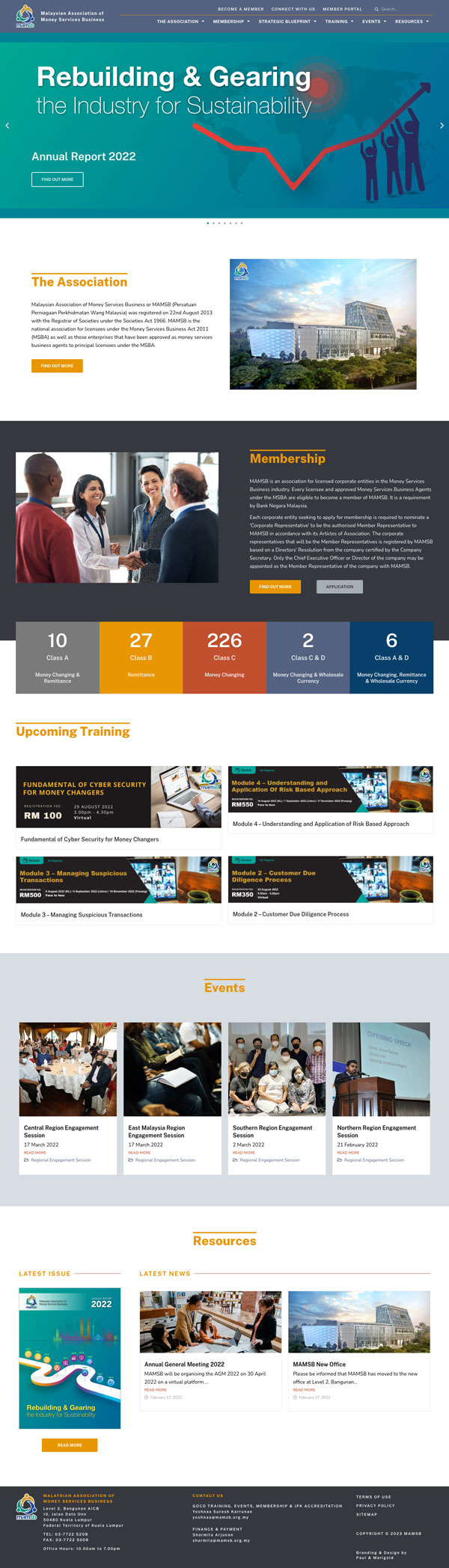
Six years after the creation and launch of MAMSB, there was a need to ensure that the association remained relevant and current now and in the future.
As the website is the main touch point of interaction and face of the association, it needed to be a 1 stop centre of information. For members and non-members of the industry and association.
The look and feel of the website needed to take on more of a professional, international, corporate and fresh look that members, professionals and financial institutions can relate to and have confidence in.
We refreshed the MANAGEMENT magazine brand with content covering a broader scope of topics such as leadership, finance, digitalisation, law and HR. Keeping in mind the next generation of leaders both the print and digital versions have been approached with clean spaces, a simplistic design and layout complimented by a pastel colour palette, infographics and mixture of graphics and images.
With more than 50 years of catering to leaders and management the voice of the Malaysian Institute of Management needs to be in tune with the current trends, current affairs and challenges being faced by leaders in a variety of industries. To ensure its relevance and value the publication was in need of a make-over and needed to be taken online.
Connecting stakeholders, sharing knowledge, and inspiring positive change.
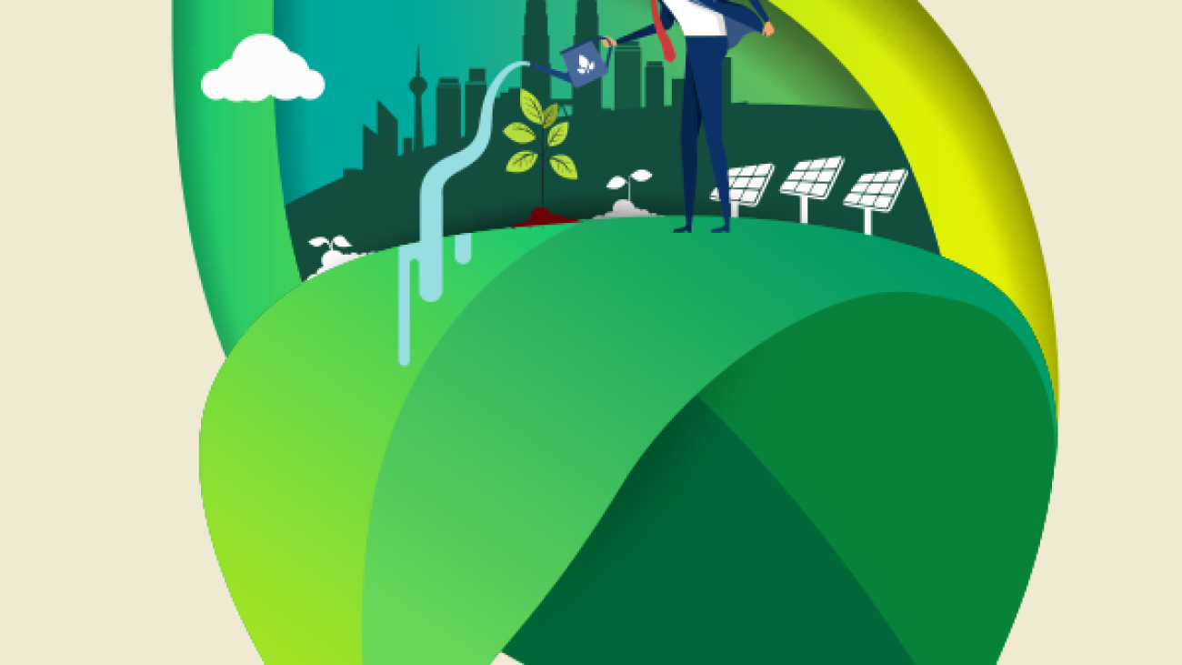
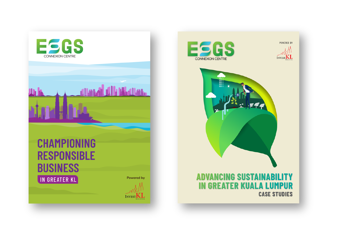
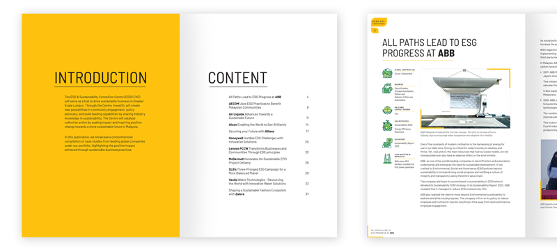
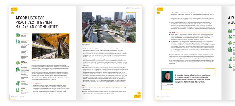
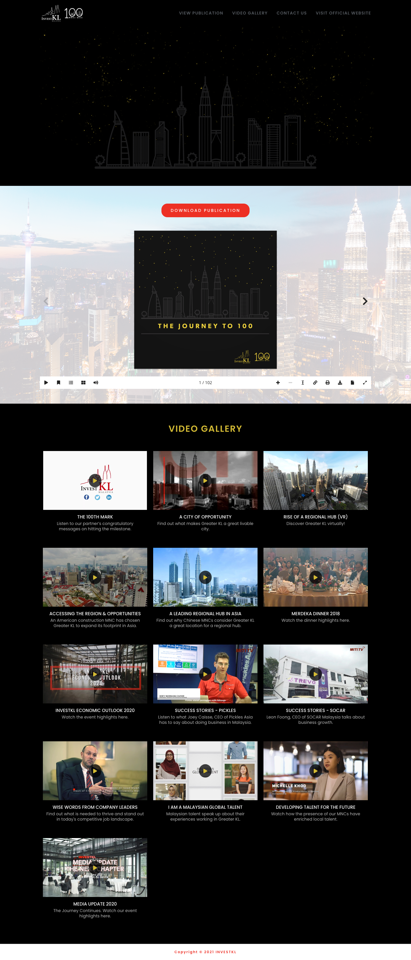
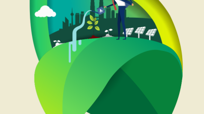
The identity created for this platform needed to be simple, contemporary and somewhat literal in regard to ESG and sustainability. Hence the usage of the green and blue traditional colours associated with sustainability. This approach was taken through both the brochure and case studies, showcasing a comprehensive compilation of case studies from leading global companies under the InvestKL portfolio, highlighting the positive impact achieved through sustainable business practices.
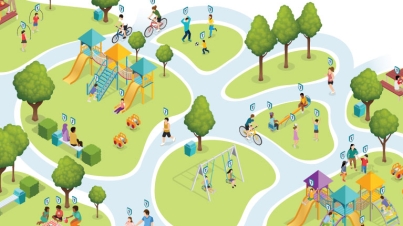
Through InvestKL a newly created platform called ESG & Sustainability ConneXion Centre (ESGS CXC), will serve as a hub to drive sustainable business in Greater Kuala Lumpur. The platform is to foster collaboration, scale impact, raise awareness, and facilitate education about Sustainability and its related initiatives. Connecting stakeholders, sharing knowledge, and inspiring positive change. Integrating responsible business across the value chain and advancing Malaysia’s aspirations towards an inclusive and sustainable economy.
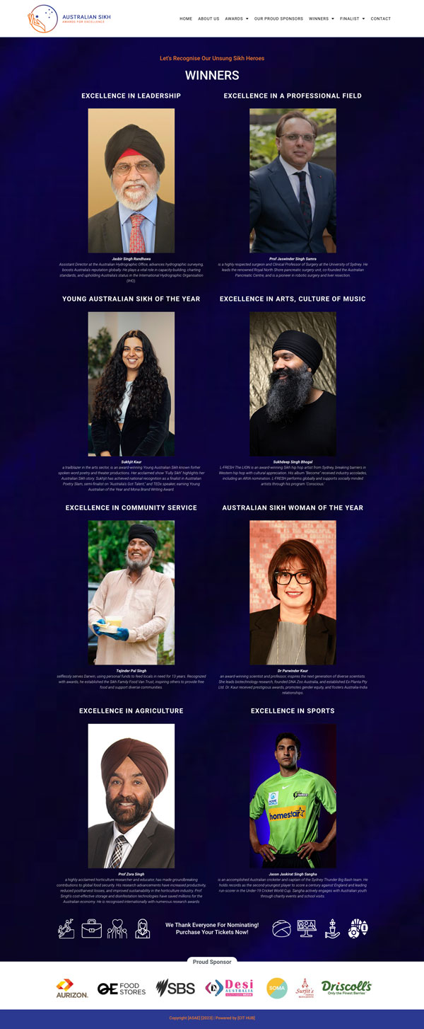
The criteria of the awards are based on 2 principles; The value of Seva (selfless service) should be evident, as framed in Sikhi and the activities of the individuals should positively contribute to the social and economic development of Australia.
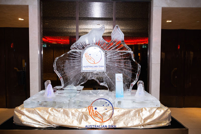
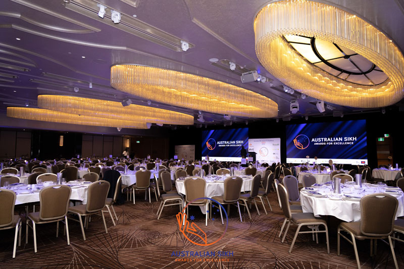
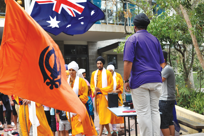
Being a newly created awards every element, and visual experience of the Awards needed to be developed and created; from the visual language, identity, collaterals, website and other touchpoints. With the long term significance of the awards in mind, the awards needs to be seen as contemporary and relevant. Through symbols, specific colours, simplistic lines and graphics, the overall look and feel of the awards is based on capturing and representing the idea of community, the Sikh identity and the principle of giving selflessly.
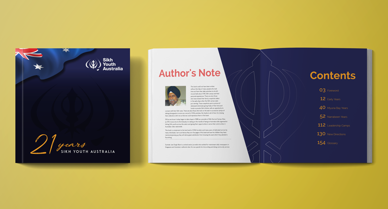
An initiative of Sikh Youth Australia (SYA) and Young Sikh Professionals Network (YSPN), the awards are about recognising the efforts and contribution to society by individuals from the Australian Sikh community. These awards are also about creating a positive and informative view in the broader community of the Sikh faith and its values, identity and culture.
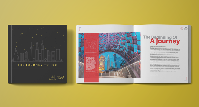
Branding, creative direction, book and website design.
More Info
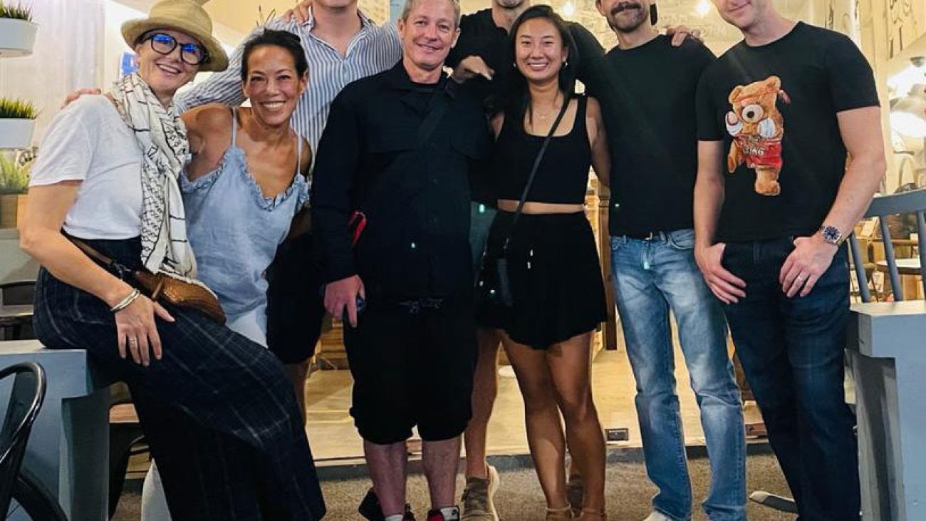
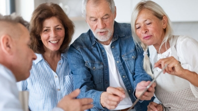
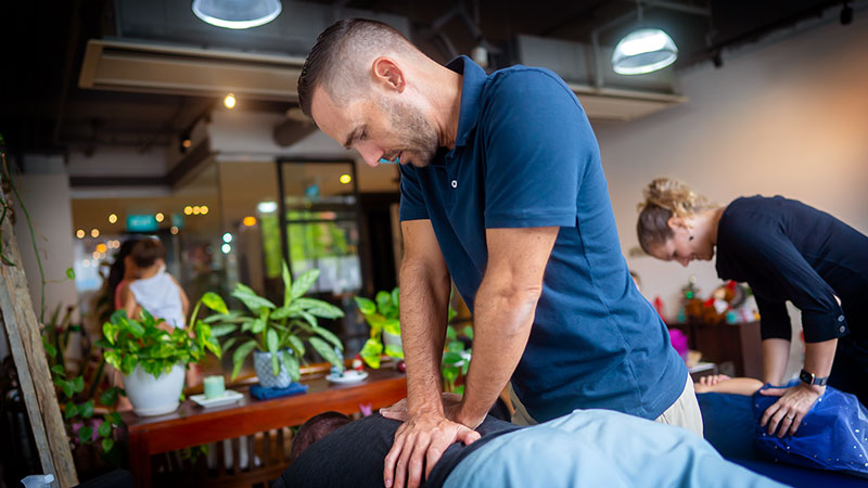
After 10 years of being in practice it was time for a refresh that reflects who and what the Pinnacle brand and practice is today. As such there was a need to revamp the website and capture the Pinnacle brand positioning and brand promise.
Pinnacle is more than just a Chiropratic practice , but a lifestyle brand, an alternative healing and wellness space for the community and families.
Targeting families and the community the website and the brand needed to be seen as inviting, warm, engaging and personal.
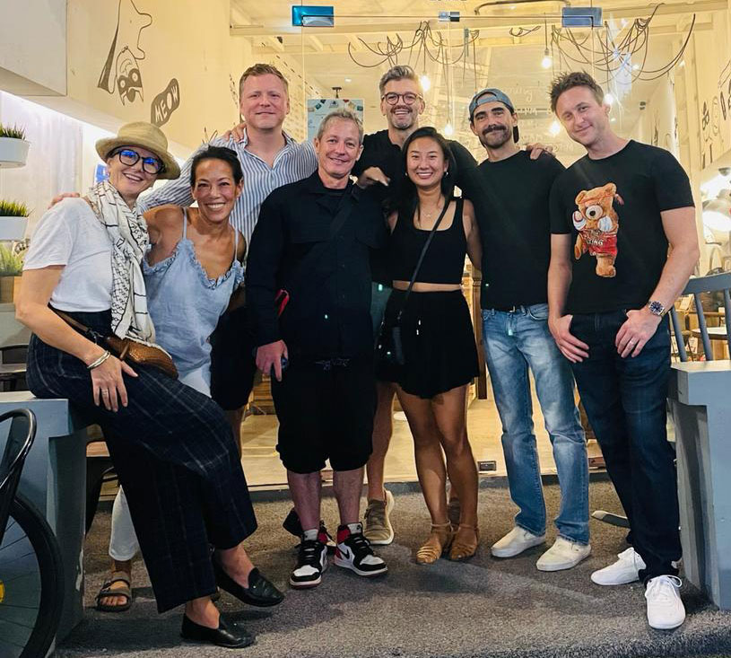
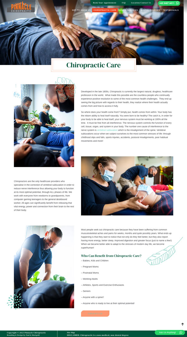
After 10 years of being in practice it was time for a refresh that reflects who and what the Pinnacle brand and practice is today. As such there was a need to revamp the website and capture the Pinnacle brand positioning and brand promise.
Pinnacle is more than just a Chiropratic practice , but a lifestyle brand, an alternative healing and wellness space for the community and families.
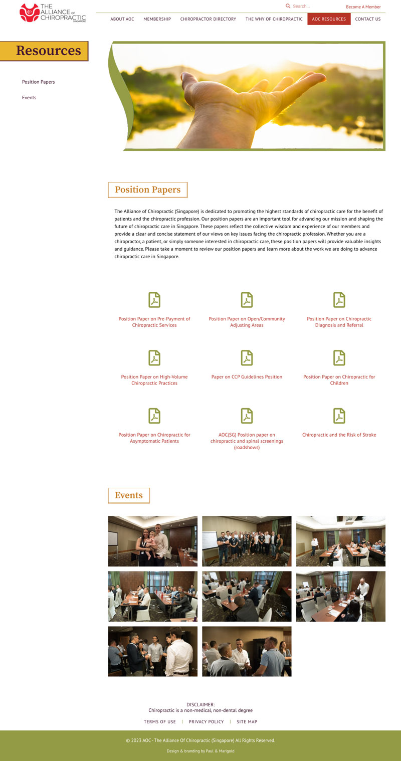
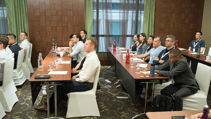
Founded in 2008 the AOC was evolving further as the leading voice and association for Chiropractors in Singapore, thus a refresh of their website, the face of the association was needed.
The vision of the AOC is not to only be for the Chiropractors, but equally for the general public. The website needs to be a platform of resource and information where users can locate a Chiropractor, understanding more about Chiropractors, be aware of the AOC community outreach/volunteering events and programmes.
The look and feel of the website needed to have a balance, catering to both types of users; professional and engaging to those in the Chiropractic field, other associations and government bodies and inviting and soft, non medical looking for the general public.
After 10 years of being in practice it was time for a refresh that reflects who and what the Pinnacle brand and practice is today. As such there was a need to revamp the website and capture the Pinnacle brand positioning and brand promise.
Pinnacle is more than just a Chiropratic practice , but a lifestyle brand, an alternative healing and wellness space for the community and families.
Targeting families and the community the website and the brand needed to be seen as inviting, warm, engaging and personal.